How to Mix and Match Colors for a Cohesive Home Design
Color plays a significant role in creating a cohesive home design. It has the power to transform the atmosphere of a room, evoke emotions, and even affect how spacious or cozy a space feels. But how do you mix and match different colors in a way that feels harmonious rather than chaotic? The key is finding the right balance and understanding how to blend colors effectively to create a unified and welcoming space.
In this blog, we’ll explore how to mix and match colors for a cohesive home design, offering tips on color theory, creating color palettes, and avoiding common mistakes that can throw off the flow of your space.
- Understanding Color Theory
Before diving into how to mix and match colors, it’s helpful to have a basic understanding of color theory. Colors can be divided into three categories: primary, secondary, and tertiary colors. The relationships between these colors are fundamental to creating harmony in design.
- Primary Colors: Red, blue, and yellow are the building blocks of all other colors. They are the foundation of color mixing.
- Secondary Colors: Green, orange, and purple, which are created by mixing two primary colors.
- Tertiary Colors: These colors are created by mixing a primary color with a secondary color, such as red-orange, yellow-green, or blue-violet.
There are also three types of color schemes that can guide you in mixing and matching:
- Monochromatic: Using variations of one color (different shades, tints, and tones of the same hue).
- Analogous: Colors that are next to each other on the color wheel (e.g., blue, blue-green, and green).
- Complementary: Colors that are opposite each other on the color wheel (e.g., red and green, yellow and purple, blue and orange).
Understanding these relationships can help you choose colors that will work well together in your home design.
- Start with a Neutral Base
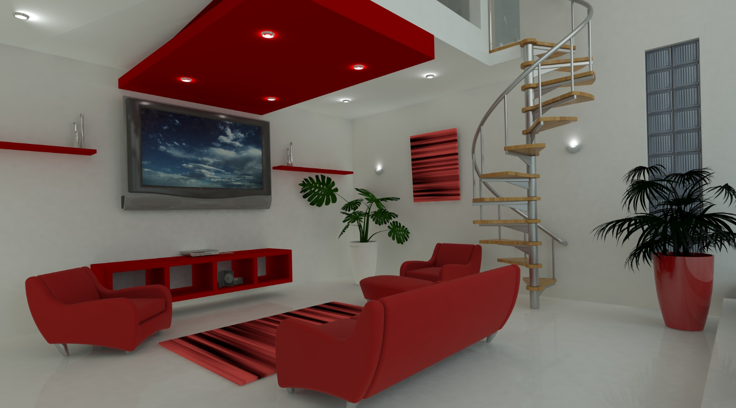
Neutral colors like whites, grays, blacks, beige, and taupe are timeless and versatile, making them an excellent foundation for any room. When mixing and matching colors, it’s a good idea
to start with a neutral base and build from there. Neutrals provide a balanced backdrop and allow you to experiment with bolder accent colors.
For example, a light gray wall creates a calm and soothing atmosphere, while allowing you to bring in pops of color through your furniture, artwork, and accessories. Neutral furniture, such as a beige sofa or a wooden dining table, can serve as a versatile canvas for colorful cushions, rugs, or throw blankets.
Why Neutrals Work:
- They create a calming, timeless atmosphere.
- They provide a neutral backdrop that allows accent colors to shine.
- They allow you to experiment with different hues, patterns, and textures. 3. Create a Color Palette
A color palette is a great way to organize the colors in your home and ensure they complement each other. It typically consists of a few main colors (usually three to five) that can be used consistently across different rooms. A well-curated palette creates flow and unity, making the design feel cohesive from one space to the next.
Steps to Create a Color Palette:
- Choose a Dominant Color: This is the color you’ll use most frequently in a room. It could be a neutral (like white, gray, or beige) or a bold color like navy blue or emerald green.
- Select Complementary or Accent Colors: These colors should complement your dominant color and be used sparingly in smaller elements, such as cushions, throws, or decor. Use two to three accent colors to add depth and visual interest.
- Add Contrast: A contrasting color helps balance out your palette. For example, if you have a warm-toned room (with colors like red and orange), add a cool contrast (like blue or green) for balance.
- Test Your Palette: Before committing to a palette, try out small samples in your space. Light can dramatically affect how colors appear, so it’s essential to see how they look in the room before making a final decision.
- Incorporate Patterns and Textures
While color is essential, texture and pattern are just as important in creating a balanced and cohesive home design. Mixing and matching patterns can add personality and energy to a room, but it’s crucial to do so thoughtfully.
Tips for Mixing Patterns and Textures:
- Stick to One Color Family: When mixing patterns, choose different patterns in the same color family to ensure that they don’t clash. For instance, pair a striped pillow in navy with a floral pattern featuring navy and white tones.
- Vary the Scale of Patterns: To create balance, mix large-scale patterns with smaller ones. For example, combine a large geometric rug with small-scale polka dot pillows or a floral print.
- Add Different Textures: Textures add depth and richness to a room. For instance, pair a velvet sofa with linen throw pillows, a shaggy rug, or a leather chair to create an inviting, tactile space.
By incorporating both patterns and textures in your home’s design, you can mix colors creatively while ensuring the space feels harmonious and cohesive.
- Use the 60-30-10 Rule
The 60-30-10 rule is a widely used design principle for creating a balanced and cohesive color scheme. This rule dictates that:
- 60% of the room should be your dominant color.
- 30% should be your secondary color.
- 10% should be an accent color.
For example, if you have a neutral-colored room with white walls and beige furniture, your dominant color might be a soft gray (60%), the secondary color could be a soft blue (30%), and your accent color could be a pop of yellow (10%) in the form of throw pillows or artwork.
This rule helps keep the space visually interesting while ensuring that no one color dominates too much or feels out of place.
- Create Balance with Light and Dark Tones
A room full of light, airy colors can feel one-dimensional, while a room with only dark, intense tones may feel overwhelming. Balancing light and dark colors within your space is key to achieving a harmonious look.
Tips for Balancing Light and Dark:
- Mix Light and Dark Furniture: If you have a dark sofa, balance it with lighter furniture pieces, such as a light-colored coffee table or bookshelf.
- Contrast Light Walls with Dark Accents: If your walls are light-colored, use darker accent colors for your furniture, artwork, or textiles to create a visual contrast and add depth.
- Layering with Textures: Use varying textures, such as leather, wood, metal, and fabric, to create contrast and balance even when the colors are similar.
- Consider the Room’s Function
When choosing colors, consider the function of the room. Different colors evoke different moods, so it’s important to select colors that suit the purpose of each space.
- Living Rooms: Neutral colors, combined with warm tones like mustard or deep red, create a welcoming and comfortable environment.
- Kitchens: Lighter, brighter colors like white, yellow, or pale green can promote energy and cleanliness.
- Bedrooms: Soft blues, greens, or muted tones promote relaxation, while rich, deep colors like navy or burgundy create a cozy, intimate atmosphere.
- Home Offices: A combination of light neutrals with accents of energizing colors like blue, green, or orange can promote focus and creativity.
- Use Color to Define Spaces
In open-plan homes or large rooms, color can be used to visually separate spaces and define different areas without the need for walls. By using contrasting or complementary colors, you can create a sense of division and flow in your space.
- Rugs: Use a rug to define a sitting area or dining space in a larger room. • Accent Walls: Paint one wall a contrasting color to create a visual boundary.
- Furniture Arrangement: Position furniture in a way that visually separates areas, such as a reading nook or dining zone, using color as a subtle divider.
- Incorporate Metallics and Reflective Surfaces
Metallics, such as gold, silver, or brass, and reflective surfaces like mirrors can add sophistication and glamour to any room. Metallic accents pair well with both bold and neutral colors, enhancing the overall design without overwhelming the space.
- Metallic Frames: Use metallic picture frames or mirror frames to reflect light and add elegance.
- Shiny Furniture: Incorporate a metallic coffee table, lamp, or even a kitchen island to introduce a modern, chic vibe.
- Reflective Surfaces: Mirrors or glass furniture can amplify light and make the room feel larger while adding a stylish, modern touch.
- Pay Attention to Lighting
Lighting is a crucial element in any room design, as it affects how colors appear. Natural light can make colors look brighter and more vibrant, while artificial lighting can add warmth or coolness to a room.
- Use Layered Lighting: Incorporate ambient, task, and accent lighting to create depth and highlight your color palette.
- Warm vs. Cool Lighting: Choose warm-toned bulbs for a cozy, inviting atmosphere and cool-toned bulbs for a more modern, crisp look. This can subtly alter the mood of your space and influence how colors appear.
Conclusion
Mixing and matching colors in your home is an art that requires balance, thoughtfulness, and an understanding of color theory. By starting with a neutral base, creating a cohesive color palette, and experimenting with textures and lighting, you can transform your space into a stylish and harmonious haven. Remember, a little creativity goes a long way in making your home reflect your personality and style, all while maintaining a cohesive and visually appealing design.